JoelChaimHoltzman
Promise of Power: My first Expo (2017)
Hi Everyone,
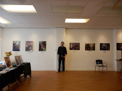
In this blogpost i would like to talk a bit about my experience on my first expo, especially the opening, and i hope it encourages you to set up your own!
How it all started
I went to an exposition of friends, around a year before i decided to do mine. They were present at a local art collective and they invited friends and family. Food was present, music even and a general good vibe. I wanted to try something similar.
So i am a regular customer at my local American Book Center and i noticed that they organize various expositions upstairs. One day i just asked the store clerk if i could enter, and after showing my work he was excited and then the preparations were being made.
First steps
At first i decided to just use prints and frame them, invite a couple of friends/family and generally have a good time. The news came to my dads ears, and as a man who was a succesful artist back in the day, with expositions around the world of his photography, he implied i should take this more seriously. I should ditch the paper prints for this purpose, and he would help me get some proper prints.
The more we worked on this, the more serious the entire idea became! I decided to invite alot of people. Print flyers, ask friends, friends of friends, old friends, and future friends. Family and in-laws.
Ordering prints
I went to the local print stores and noticed a few options that caught my attention:
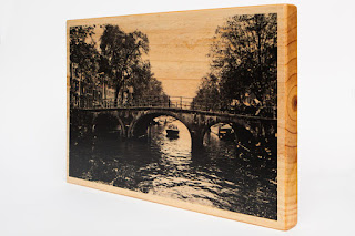
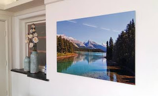
(I do not own any of the 3 images shown as example below)
Option on wood: Artwork would be printed on wood. Either with or without white colors (so that the wood would replace everything that is white) I did not choose this option because my work contains too many value ranges on different places. It would be a mess. This option, however, would work on media with strong contrast and a limited valuerange.
Museum glass: This is the most aesthetic pleasing of all options. It is something, as the name says, that could hang in a museum. The colors come out nicely and the print has a nice coating of glass for an extra professional feel. I considered this option but it was a tad too expensive. I do not have an audience that generally collects more expensive artwork/originals, mostly prints, so i should find a nuance for now.
Forex print: This is the option i decided to take. Its a high quality form of cardboard which is very light. the colors come out extremely nicely even though the print is extremely matte. However, since the material was so light/fragile it couldnt be fastened with a hanging device. This proved to be a pain later on, since i had to fasten it myself!
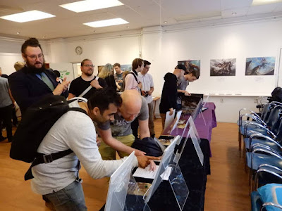
90% of the effort was aimed towards the opening. The most people would be there at once, after that the expo would be present for a month where only a trickle of people would be there at the same time.
I invited everyone i have and had contact with, the latter aiming to reconnect and hopefully rekindle old friendships. In many cases it happened succesfully! I am working with old friends now to expand my business and i had great talks too with people i didn't see for a while! People who were important in my life connected with each other as well which was great to see.
To backup the costs of the event i had a booth selling prints, as well as showcasing work not hanging at the expo itself.
The most important part of this expo was not to sell prints necessarily, but mostly for the reasons mentioned above. its a great experience, and it adds alot to a professional atmosphere around your work in general.
I recommend every artist take a stab at this. Invite your family, friends, old and new, fellow artist and print alot of flyers! Spread the world and who knows who will come to check out your work. It's a great reason for you and enthousiasts to look at your work in a different light.
Hope this was interesting and even inspired you to take a similar initiative as i did! To this day i even hear at conventions that people saw my artwork IRL at this exact expo and i connect with them immediately. If you have any questions regarding setting up your own expo, make sure to message me!
All the best,
JCH
Ressurection of the Outlaw King (2016)
Hi everyone,
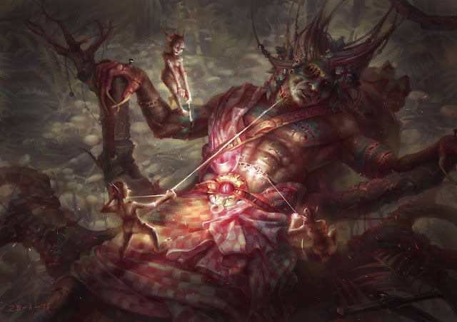
Here is another Walkthrough from one of my recent more succesful paintings (2 yr). It depicts William Wallace, After being slain by the english. His king makes a pact with the Gwyllions of Wales to resurrect him, by stitching him while he is nailed to trees. Just playing around with history and myth around the same area and time.
Resurrection of the Outlaw King
''The Guardian of Scotland is Dead; Betrayed by our enemies, branded traitor and mercilessly executed.''
Hope is lost among the Clansmen, but I, Robert the Bruce, Heir to the Scottish throne did not. The Gwyllions of Wales want to play.They have recovered William's dismembered bodyparts and restitched them together for our cause. They even clothed him in old scottish manner and donned his warpaints.
With their unholy blessing our hero will lead us to victory once again, but at what cost? When we win this war, what will these hags do once they have access to the Throne of England? ''
Idea sketches
In this painting i wanted to depict the battle fought when WW is already been resurrected, as some kind of frankensteins monster, next to Robert the Bruce, the future Scottisch King. I liked the motion but i didnt use it because it wouldnt emphasise the entire selling point, which is that WW is resurrected by a mystical power.
In this painting i wanted an stoic scene where WW and Robert are ready for battle. As with option 1 it just didnt emphasise the selling point, and just wasnt that spectacular in general. The background seems a bit weird as well (doesnt fit the mood and narrative)
This is the sketch i eventually chose to pursue. It has an interesting angle, it tells the story in a clear way, and it has the best mood of the 3 sketches. I also chose to retain humanoid proportions for WW because i didnt want the character to look too comical.
Here is the chosen sketch after some work. It looks pretty decent so far, but the more i worked on it, the more i got overwhelmed by the piece. It was all to blame to not using the proper reference or only using it halfway.
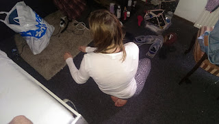
I used my girlfriend as reference. As you can see this doesnt look like anything i am painting. She doesnt wear the clothes of WW. she doesnt have the body type of WW and her arms arent leaning on anything. This reference is 99% useless besides the pose perhaps.
Here is when things are starting to get hard. I started to lose control of the values when moving to color (Thats why you should check your values at ALL TIMES through a Hue/Saturation layer). The piece lost its mood from the sketch and i did not use proper reference for the kilt/body. I just grabbed something from the internet and tried to integrate it on the pose of someone lying down, which i can guarantee you NEVER looks 100% natural, as you can see above.
Here is a comparison of the greyscale version from before and after i added color (so you can see how it went wrong)
Left piece has a pretty intense mood, accompanied with a wide value range, while the right piece (where i started to add color) started to look messier in general, while losing the sinister vibe the first sketch had.
This is where things started to become frustrating. I started to render only realising after a while i am not anywhere near a realist level. The mood is still missing (its a tad better due to the darker background) the folds are slightly better but not perfect (as i will show you later) and the anatomy is so, so. Alot of guessing again from reference that isnt in the same pose whatsoever, and no time is spent emphasizing the muscles.
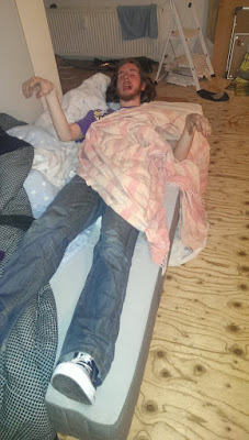
Here is a reference piece use for the piece above. I shot a photo of a male friend to better suit the subject. Its slightly better than the first reference but again, not there at all. The cloth is just strewn on his body, not wrapped around like a kilt, nor does it have the same pattern as a kilt. The upper body of my pal should have been exposed to show muscles to help me paint them.
At this stage things are starting to look brighter. I used proper reference on the clothing and it shows. The background is painted decently but the mood has been lost again after a
while of painting. Always make sure to check earlier stages of your painting to find parts you lost but could use again!
At this stage i started to take things way more seriously. I asked another friend to tie a sheet around his middle and a another sheet around his torso/hips (fastened with a belt) to make it as realistic as possible. Too bad i didnt take the time to find a checker sheet to emphasise the kilt itself, but the largest part has already been done. However, i still needed to find reference online for prominent muscles (no offense to my buddy ofcourse!) but at least right now i knew where to place them.
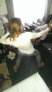 At this stage things are starting to look more finished. Rendering to its fullest, as well as finding proper reference for the little Gwyllions for which i used my girlfriend. She wasn't comfortable with doing nude shoots so we shot the photos with stretched clothing. The lady sitting bottom right was hard for me to do with clothes, i couldnt see certain muscles bending with the movement properly, so she agreed to take one photo without clothes.(which i am not going to share for obvious reasons :-p)
At this point the piece if finished. I emphasised the focal point to be the center of the image, where all the seweing is taking place. The golden beltbuckle serving as a bounce light source to light the gnomes and part of WW's face. When characters are lit from below it always give you a more dramatic and foreboding vibe, so i took full advantage of that. I darkened the surrounding area of the image to get the sinister feel back, but i had to watch out to not get TOO dark. The most important part is just to have the gradiation going of the values (from dark to light).
This piece took alot out of me; It was hard, challenging, but i learned alot when it comes to preparation and proper reference usage. Taking things to the next level so to speak.
I will try to make these blogpost a 1/2 week thing. I really like to share knowledge and hear positive things from people. Sharing is caring after all!
Please let me know what you think of this post,
Have a great one!
JCH
The Khan and the Horselord (2016)
Hi everyone,
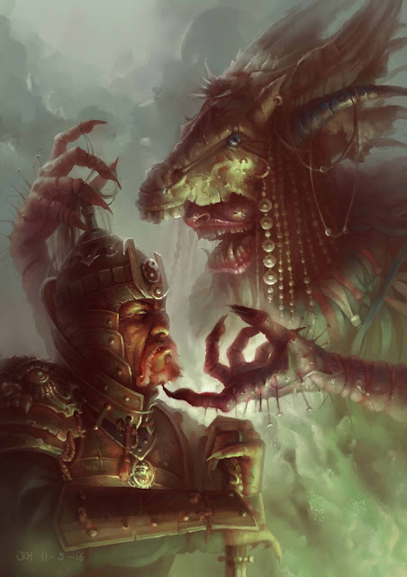
Now that ive shared the process of learning the craft through a mentorship i would like to explain how i made various of my portfolio pieces. Today we will talk about my piece the Khan and the Horselord, An interpretation of the tale where the devil promises Jesus the world but he declines, but in this storyline the devil goes to Genghis Khan and promises him the same. The latter accepts thus he becomes the greatest conqueror in history.
''Who am i you ask'' The hooded stranger grinned. ''I am a wanderer, searching lands beyond hidden borders for the most capable souls who have the capability and will to wield great power. Only two worthy men i visited, one in Nazareth, and the other one is you, Temujin, conqueror of Mongolia.''
The Devil took him to a very high mountain and showed him all the kingdoms of the world and their splendor.''All this I will give you'' he said,''if you will bow down and worship me'' Feeling presence greater than Temujin knew he was capable to either fight or achieve on his own, he knelt befor the fallen angel, and looked upwards.
The Devils grin broadened. ''Arise, chosen one. Arise as Genghis Khan, and make the world tremble!''
Thats a story i have written to backup the piece! Now we have got that part out, i will explain how i started.
Thumbnailing
A process which i use when i would like to view various compositions from a distance without delving too deep into details yet. It helps me to read the image in an instant. if it doesnt work, here, it will never work, so it is important to be critical with yourself when using this method. You can easily pass the 20+ sketches in this method.
As you can see i tried various poses, closeups, interactions and lighting. Some of them work, most of them dont. Its important to get as much as possible out of your system, since there might be a better option lurking. You dont know if you dont try!
The way i did this process in quick way is making the thumbnails in a selected layer (so you wont paint outside the box) and just copy them, and altering them every time.
At this point i found myself an interesting comp, where the story in my opinion is told the best. I wanted the focal point to be at Satans hand, where the interaction between the two characters is
taking place.I started to look for a fitting color scheme.
I played around with various color schemes until i found one that emphasised the atmosphere of my story the best. I went with a lowly satured mix of red, blue and green, to create an eerie and foreboding atmosphere.
Reference gathering
Now its time to understand what i will be painting. I bought colored lightbulbs and used them to light myself, posed. My apologies for the low webcam resolution. The program i used to take snaps at the time was a free version. As i used the colored light, i noticed interesting things starting to happen with the colors. The unlit areas starting to turn more red, as red is the opposite color of green, which is the light source.
From here i needed to find reference and inspiration for the aesthetics of both characters. Unfortunately i do not have these references anymore. I was stupid enough to throw them away after i was done with them, but i have learned to do better now.
Lets begin!
This is literally the untouched thumbnail i decided to use for the project. Everything is there exactly as how i want it to be,
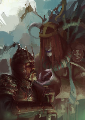
Back when i made this piece, i didn't take the time to prepare fully with reference and inspiration gathering, so you will see alot of trial and error in the subject matter. Again, i learned to do different. At this stage i tried to set a the conceptualization. Satan Took inspiration from Siberian shamanism (the mask) and Genghis Khan took inspiration from traditional Mongol clothing. No offense to mongolian fashion (i like it alot) but it looked more comical on someone as brutal as Genghis so i decided to change it for armor.
I was lucky here, since i pretty much immediately nailed the armor the way i wanted it to be. Note: This is not mongolian armor. I took inspiration from Medieval Chinese plate armor to make Genghis look more royal, as if he scavenged the armor from a Chinese general or so.
I worked alot on Genghis' face. I used my face a little too much as a reference and he started to look more like an arabian knight, due to my prominent nose. I had to search for correct mongolian features and flatten the face. Also, i rotated Khan a bit, to make it look as if he is leaning on his sword more; kneeling. When i finished the Khan for the most part, i got overwhelmed by the image. I lost control and i started to play around without a sense of direction on the Satan part. The image flattened, the focalpoints and readability got lost. This was a perfect moment to take a step back.
On this stage i started to climb back a bit. I got back to a similar style of the initial horse mask for satan and a background/foreground started to form as well. I defined the silhouette of Satan as well. However, a focal point was still missing!
At this point the image is nearing its final form. I made the focal point the hand, bu using the lightest light, and the darkest dark together on the same spot. as well as the harshest contrast. I wanted the image to be about the interaction between the two characters, and the degrading left hand gesture of satan is a key element in that.
I didn't like the left placeholder face of Satan. It looked to dorky and even a bit comical. An entity as satan could at least be more terryfying! so i looked at various siberian ritual masks. i tried something with it, and i felt it aleniated the image of Satan a bit.
I changed the face of satan to something resembling an asian demon. Since only the lower part of the face was visible, the mouth had to be prominent. At this point the image is 99% done!The focal point/hand wasnt as detailed yet. you always want to reward the viewer by making the focal point as interesting as possible. I decided to add more flavor to the piece by adding voodoo nails onto Satans hand, as well as some extra textures.
Now the piece is finished. I hoped this blog will help you on your journey as an artist, or if you are just an enthousiast of an artistic process in general. Please share your thoughtprocesses below in the comments, and i will see you next time!
All the best,
JCH
www.joelchaimholtzman.com
Back From the Monastery Part 4: Epilogue
Hi All,
This will be the last part of my ''Back from the Monastery'' Series, about my mentorship with Sam Flegal. This blog will be slightly bittersweet, but not too hard to handle hopefully, haha.
Bear with me.
The Cordyceps King
After a succesful year with the mentorship, ehnancing my skills with art, convensions and web presence, it was time for me to set my first step into the world of big people. I was excited for that, but it didnt go without too ups and downs. It started positively. The piece shown above was the final piece i finished under Sam's guidance. It received the best acclaim of any piece i shared so far. It got a Daily Deviation on Deviantart (my first one!) and i got featured in a French Photoshop magazine. I felt i was in the game!
A few months of work ensued, until a few people i was supposed to work with either werent cancelled or dissapeared from the project due to numerous reasons. I didnt have work for a while. And i felt upset, since i expected alot more after being supposedly having a professional level. I felt bad about it, since i am a pragmatic person. If something in my piece is off, and someone points it out, i fix it. It was harder here, since i did not know what to do after getting the quality of my work to a level i wanted.
I talked with various folks, brainstormed and let the time go by. I concluded the following:
Competition:
When you reach a pro level, and you aren't on top of the food chain, you will have to struggle through it. I barely have contacts in the field i would like to work in, which turns out helps alot on the long run; the Netherlands is more of a comic/graphic design country, which is also why i barley have contacts in the field of art i am doing. I Wondered why i didnt get as many job offers as i could have had, and it turns out art directors tend to hire people way more efficiently when they meet you in real life as well. Emails work way less due to the influx they get each day.
This means i will have to go to other countries to hunt tconventions and the jobs i want on a more efficient way.
When i eventually connected the dots, i calmed and looked at further options to garner my income. Various other seeds besides freelancing have been planted. Besides hunting freelance I am planning to go to more conventions, focus more on print sales, kickstarter and even start a mentorship of my own. All these elements are working slowly atm, but hey, they are working!
Hope these series of Blogs helped you so far. In the future i will try to share something weekly, whatever is on my mind at that point.
All the best!,
JCH
www.joelchaimholtzman.com
Hi Everyone,
In the last Blog we talked about my experiences with conventions. Today i will discuss my web presence, and how it currently helped me, and hopefully will even more in the future.
As another part of my mentorship with Samuel Flegal we talked about me getting the most out of my exposure on the internet. It seems there are alot of layers to peel here to maximize your exposure and make potential enthousiasts of your art have an efficient and enjoyable experience browsing it.
Hope this blog helps you!
Getting Followers on social media
Its the first thing people think about when they hear the world exposure, and rightfully so. On this section i will tell you a few ways i think you can improve your overall following on the internet. Each platform has its own way to handle things but i will tackle the general bulletpoints for now.
1. Post consistently: The more and consistent you post, the more you will remain in people;s retina. It will also get you higher on peoples walls due to algorithm which is present on most platforms.
2. Post quality: Even though your work is okay-ish and better than the average human being, internet is flooded with it. We get bombarded by it all the time on all the platforms. Thats why even though it might sound harsh, mediocre work gets ignored. hard. Only post the work you are most proud of and it will show.
3. Interact: If people see you are interacting with them, commenting on their art, giving advice, share WIPS, sharing knowledge, it will get you liked and indirectly familiarized with people and they will be more eager to follow you.
4. Thinking outside the web: Among my most quality followers, (most engaged followers) are people which i met outside the internet. I am not talking about my family or friends only, but people i met on conventions. Try meeting new potential lovers of your art outside, and due to the personal interaction you can get lifelong supporters out of it (see my former blog post).
5. Shameless promotion, what does that even mean?!: There is no such thing as shameless promotion. Share on every group and platform you can think of for maximized exposure. However, dont cross the line by breaking any group rules.
6. Post in relevant groups: Find your niche and interact with that area. It doesn't make much sense to post your realistic dark fantasy art in a group where most people adore chibi art of their favourite animals.
Getting to know the platforms
Now you know how to get followers, its time to find out where to find them. In this section i will discuss most notable platforms i use. Some of them require more knowledge to handle properly, some are just good to have around without paying too much attention to them.
Facebook:
Post as much relevant content daily as possible, but dont get too spammy. Your followers here have a more personal connection with you here in general so you would like to be more connected with them. Posting to groups which are aligned with your artwork is a must too. Do not post/share from your art page! Facebook algorithm forces you to pay money for more people to see your artwork there. I recommend turning on the ''follow'' function and do everything from your personal account.
My Account: www.facebook.com/joel.holtzman…
Instagram:
Post every day as much relevant content as possible with the correct hashtags. Also make use of the ''story'' function to share 24HR snaps, if you aren't interested in posting that specific photo permanently. Instagram is one of the most used social media platforms to date so being active there could garner you a lot of followers
My Account: www.instagram.com/joel_chaim_h…
Twitter: This Platform is tricky due to it being bloated. You can easily get 1k+ followers which results in it being hard for your followers to see your posts, because they might follow that amount of people as well. My advice, follow as many interesting/relevant people as you like, and that will be the moment, when they see you followed them that your account will have theyr fullest attention.
My Account: twitter.com/JoelCHoltzman
Tumblr:
Same as twitter and instagram. Be connected with other people. Reblog /like/follow their stuff to get noticed in the beginning. after that its just a matter of blogging alot to stay updated and get reblogs easily after.
My Account: joelchaim.tumblr.com/
Linkedin:
The most unused platform for art in my experience. I just share my art here through other platforms when they offer me to. Further more i connect myself with all relevant people to garner a mutual following.
My Account: www.linkedin.com/in/joel-chaim…
Pinterest: Besides being a goldmine for inspiration, you can also post your art in various boards for other people to repin. Make sure you have pinned alot of inspiration for people to follow you, and after that repin your art. pretty much a win-win situation; You pin your inspiration, and you get exposure as well!
My Account: nl.pinterest.com/joelchaimholt…
Deviantart:
Seen its glory days, its the most crowded art related site of the world. From amateur to professional, it takes time to stand out. If you start out share your art in various groups to get seen and be consistent with it. After a while you will see your followers number increase and you will get likes/exposure by itself.
My Account: joelchaimholtzman.deviantart.c…
Artstation:
A site where mostly professionals are present, and people are hiring. It is mostly focussed on concept art, but more illustrative artists are here as well. Personal interaction for exposure is crucial in this platform due to the limited amount of users compared to deviantart for example.
My Account: www.artstation.com/artist/joel…
Behance:
Another design site. As described previously interaction is crucial to gain a following on this platform.
My Account: www.behance.net/joelcholtzman
Blogger/Youtube:
Excelent platforms for exposure. People really like to learn and delve into the personal life of an artist. When you use these plaforms post regularly to build a consistent reader/viewerbase. This really takes time to build.
Reddit/Imgur:
I heard these platforms are potential exposure goldmines, but I dont have too much experience on these platforms. If you do please share them in the comments
Making your portfolio website
I see a lot of questions and confusion regarding how a portfolio website should look like. Here are some bulletpoints i would like to share with you on how to make your website as readable as possible for art directors and enthousiasts.
1. Keep it simple: You can add as much gadgets on your website but it most likely just distracts your viewer. Keep separate tabs for each thing you would like to share.
2. Only show your 8-12 best works: Art directors have limited time, they dont want to scroll an unending protfolio. Besides, you get picked for your worst piece. Limiting the chance of having a the worst piece stand out is dont by having the 8-12 piece limit.
3. Dont post student work/studies in your potfolio: It is unusable for 99% of potential clients, and as the title says, it shows a studentlike feel to you an an artist. Avoid this entirely or make a separate tab for it with your best pieces of that specific subjectmatter.
4. Make 1 tab with all your pieces in it: People are not keen to search for your best pieces scattered through 3-5 tabs. Since you only need 8-12 pieces anyway in it you can put your best illustrations, character art and environments in 1 tab.
5. You will get hired for the work you show in your portfolio: As the title says, you will get hired for the work that you show, so only add works that you really like to make. If you would show pieces that you don't like to make it would probably show anyway.
6. Dont use custom websites: Alot of people use Artstation or even worse WIX/Deviantart as their portfolio. While they may serve as artdump platforms, as portfolio sites they look highly unprofessional, with an exception for perhaps Artstation. The problem i have with the Artstation portfolio is that the thumbnails are INCREDIBLY small and cut off your images.
7. How to present your artwork: When making your website, make sure all your images are viewed in full, not too small as explained in point 6., but not too large it covers your entire screen. Make the images clickable so that if someone would like to view the piece in large the posibility is present.
My website for inspiration: www.joelchaimholtzman.com
I hope this blog helped you! Next time i will conclude my series of my hiatus year from blogging. If you have any experiences or tip and tricks regarding web presence to share, please do so in the comment section!
Wish you all the best, until next time,
JCH
